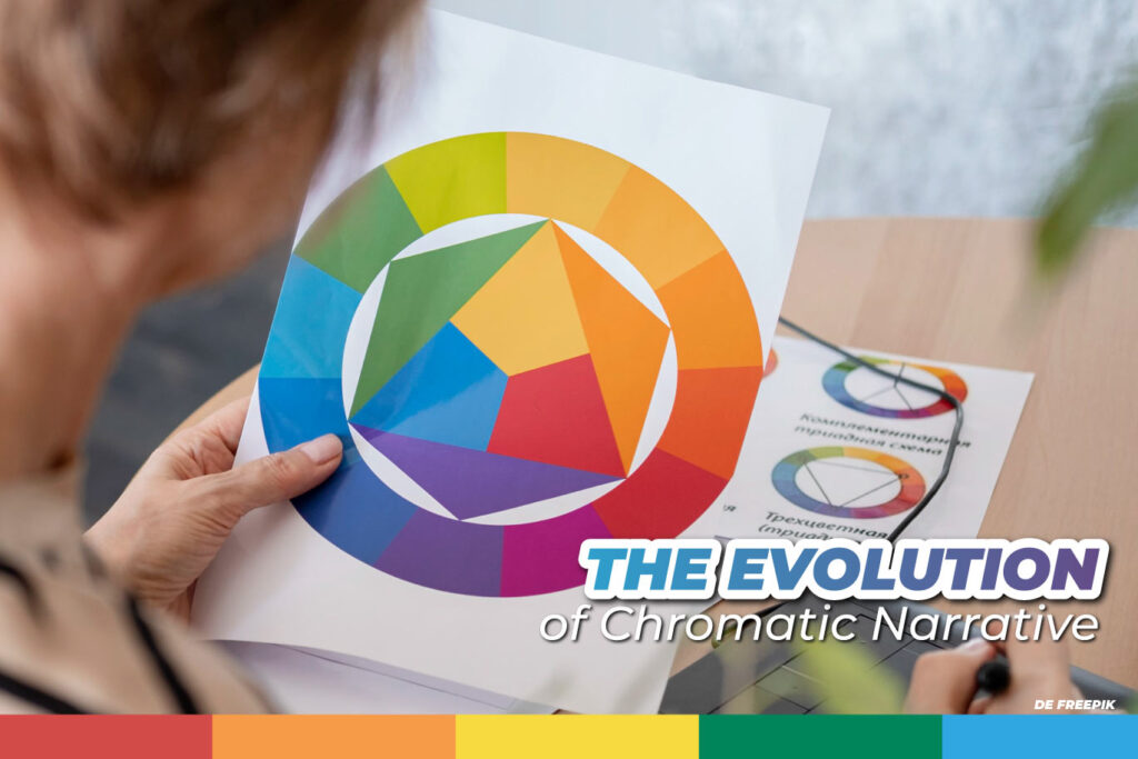
As we saw in the first part, color is not just an aesthetic element but a symbolic language that connects with our emotions and perceptions. However, its role in narrative goes beyond conveying immediate meanings. In this second part, we will delve into how color theory evolves along with narrative, creating layers of meaning at different moments in a story.
Cromathic Narrative and the Shades of Emotional Complexity
Color allows us to explore the emotional complexities of characters and their environments. For example, in the movie “Joker” (2019), the color palette changes as the protagonist, Arthur Fleck, descends into madness. At first, we see a range of muted and cool tones, reflecting his loneliness and hopelessness. But as his transformation into the Joker accelerates, the colors become more vivid and intense, reflecting the growing turmoil and internal chaos.
In this sense, color can reflect the internal evolution of a character, adding layers of depth to the narrative.
The Visual Journey: From Symbolism to Resolution
Chromatic narrative can also guide the viewer’s journey through the story. In the movie “Mad Max: Fury Road” (2015), the contrast of colors between the orange deserts and the dark clothing of the characters creates a sense of struggle and urgency. The transition of the story towards a colder and grayer setting at the end reflects the change in tone and resolution of the narrative, highlighting the passage of time and the evolution of the plot.
The Future of Chromatic Narrative
As visual narrative continues to evolve, color theory will play a crucial role in story development. With the advent of virtual and augmented reality, color will be used in new and innovative ways to immerse the audience in completely new worlds, providing multisensory experiences that transcend the visual.
Narrative and Color in Graphic Pieces for Social Media
Social media offers an environment where graphic pieces must capture the user’s attention in a matter of seconds. In this context, color and visual narrative are powerful tools for conveying a clear and concise message. Here we will explore how to integrate both elements effectively.
1. Consistency in Visual Identity
A key strategy in creating graphic pieces for social media is to maintain a consistent visual identity. This involves choosing a color palette that reflects the brand identity and effectively conveys its message. For example, a wellness brand might opt for soft and natural colors, such as greens and blues, which evoke calmness and health.
Consistency in the color palette not only reinforces the brand image but also allows for a continuous visual narrative across different posts. This helps build an emotional connection with the audience, establishing a recognizable tone and style.
2. Colors That Tell Stories
The use of color can reinforce the narrative of the graphic piece, immediately communicating the desired message. For example, in a campaign for a horror movie, dark and desaturated tones can evoke a sense of unease and mystery. In contrast, a graphic piece for a summer campaign may use bright and saturated colors to convey a sense of joy and energy.
Additionally, the contrast between colors can highlight important visual elements within the piece. In a post promoting a new product, the contrast between the background and the main object can draw the viewer’s gaze to the product, guiding their attention to the most crucial part of the piece.
3. Experiments with Color Psychology
Color theory can also be used to influence the viewer’s perception. For example, the use of warm tones like reds and oranges can create a sense of urgency, useful for limited-time campaigns. In contrast, cool colors like blues and greens can convey calmness and trust, ideal for financial or healthcare companies.
Furthermore, the saturation and brightness of colors can influence how the audience perceives the visual narrative. Bright and saturated tones can convey vitality and energy, while more muted and desaturated tones can evoke a more serious and thoughtful atmosphere.
But we have talked about color psychology before and you can read all about it here.
4. Integration of Visual and Narrative Elements
To make the most of narrative and color in graphic pieces for social media, it is crucial to integrate these elements cohesively. This means that the choice of colors, shapes, and textures should align with the overall visual narrative. For example, a graphic piece promoting a children’s book might use bright colors and cartoonish characters to reflect the cheerful and playful tone of the book.
Additionally, the visual narrative should be complemented by brief but effective text, aligned with the story told through colors and images. This allows for conveying a clear and consistent message in a limited space, capturing the viewer’s attention and generating engagement.
Our team is trained to incorporate chromatic narrative elements into every content we create. Contact us and we’ll tell the story of your brand!


