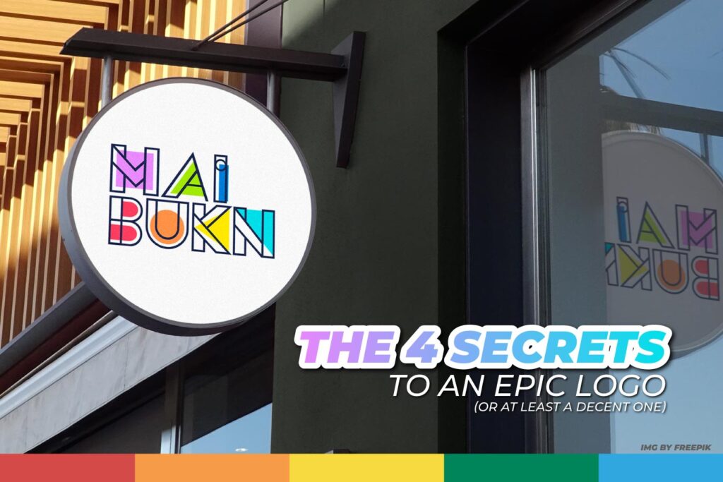
Have you ever wondered how to create a logo that doesn’t make you cringe from how bad it is? (Like the embarrassment you felt when your ex took you to eat “Hotdogs” while you were dressed up fancy).
A logo is one of the faces of your company. It’s the first thing people see and the first thing they’ll remember if it’s done right. But how do you make a logo that’s as memorable as a good meme? (And not like one of those that make you want to quit the internet).
The 4 Secrets to an Epic Logo (or at Least a Decent One)
Simplicity is Elegance!
A logo with “too much design” isn’t the key to being memorable. Imagine your logo has to tell you a joke in 3 seconds. If you don’t get it quickly, the joke fails. The same goes for your logo: if it’s too complicated, people will get bored before they can grasp the idea.
Colors That Captivate! (or at Least Work)
Colors are like the spices of life. A touch of red can make your logo super energizing, while blue conveys calm and confidence. But be careful, don’t go overboard with the palette! Too many colors and your logo will look like a vomiting rainbow. That’s why we usually recommend sticking to two or at most three colors for your logo.
Also, remember that designers know something called “color theory,” which will help depending on your business.
Typography with Personality!
Letters are like friends: each one has its own style. Choose a typography that fits your brand’s personality. Are you fun and laid-back? Try our designers’ favorite fonts like “Montserrat, Helvetica, Poppins.” Are you serious and professional? A more classic font might be your best option, “Bembo, Garamond, Glypha.”
Versatile as a Chameleon!
Your logo should look good anywhere: from a business card to your website. Make sure it works in different sizes and formats.
Common Mistakes to Avoid (So Your Logo Doesn’t Become a Bad Meme)
- Originality, Please! Copying a logo is like trying to tell a joke everyone’s already heard.
- Avoid Special Effects. They’re fine in movies, but in a logo, they can be a distraction.
- Avoid Complicated Fonts. If no one can read your logo, how are they going to remember it?
A good logo is like a good joke: it needs to be original, memorable, and relevant. If you follow these tips, you’ll be on the right track to creating a logo that people will love.
And remember, practice makes perfect! Don’t get discouraged if your first attempt isn’t flawless. Keep experimenting until you find the perfect design for your brand.
And if you can’t… You can always contact us so our team of designers can create the most epic logo for your brand. Check out our moust recent work with Maibukn.


