Before we start talking about neuromarketing in design, I will tell you a little bit about what it is.
In principle, neuromarketing refers to a discipline that studies the behavior of the brain in the process of decision making and purchasing.
To make the explanation easier, I’ll leave you with a quote from Jürgen Klaric: “People don’t buy for rational reasons, they buy for emotional reasons: how it makes me feel, and how it helps me survive, which is the intuitive part”. The example of a company that best applies this, is Coca-Cola.
Now, how to apply this to graphic design? Simple!
-
The look in the image:
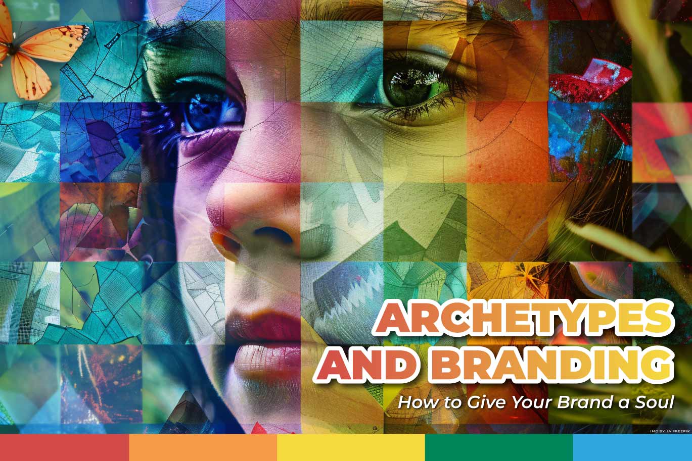
When images of people staring at the consumer are used, the attention is withdrawn from the ad, and the focus is only on the images. Therefore, neuromarketing recommends the use of images of people directing their gaze towards a point of interest. That is, either to the text we want people to pay the most attention to or to the product itself.
-
Colors:
These directly influence the way the customer feels, that is why we must have knowledge about color theory and how to apply it so that the message we want to get across works.
For example, if you want to convey happiness, it is recommended to use yellow, if you want to convey professionalism, it is best to use blue.
-
Storytelling
This is the technique for telling stories in campaigns. Studies that have been done with neuromarketing, have concluded that telling stories in ads, make consumers emotionally engaged.
So now you know, neuromarketing also applies to graphic design and its application will make your campaign more effective. If you want to know more about marketing and other interesting topics, visit our blog #WeBlogIt.


