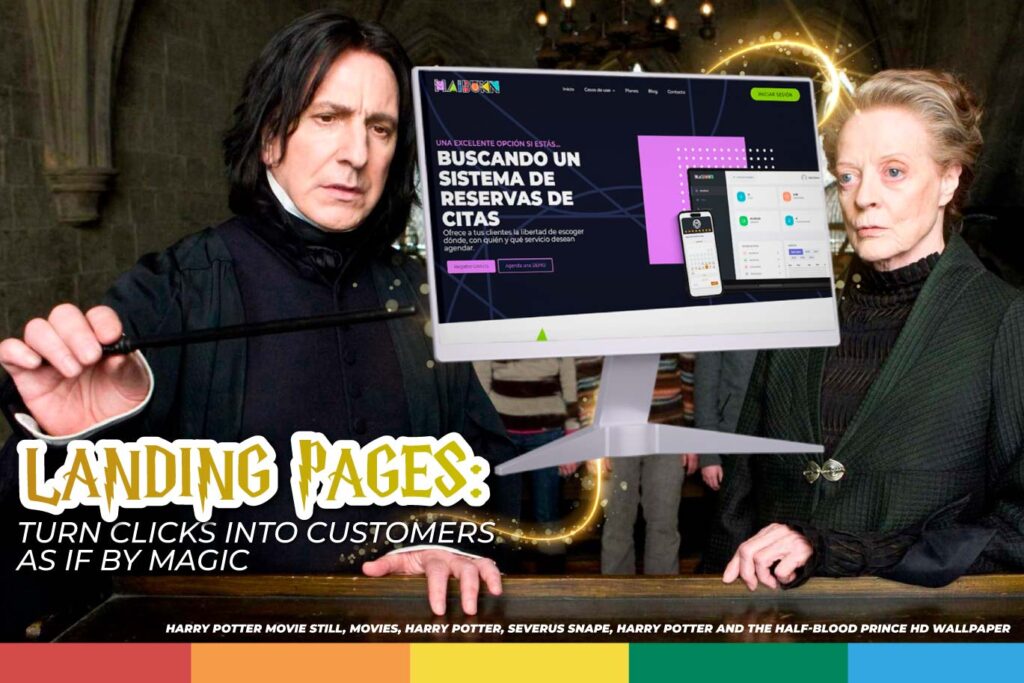
I solemnly swear that my intentions are not good. Landing pages, those seemingly simple web pages, are actually the digital equivalent of the Marauder’s Map from the Harry Potter series: they show you exactly where your visitors are and how to guide them toward conversion.
But first, you must sit under the Sorting Hat to know where you’ll go—or if you might need to head back home. That’s how crucial landing pages are to your digital marketing strategy because when they’re well-designed, they can turn your customers into the very Harry Potter.
What is a Landing Page and Why is it So Important?
Without much fanfare, a landing page is a standalone web page created specifically to convert visitors into leads or customers, without the typical distractions of a full website.
If we had to compare them to the magical world, landing pages are like advanced spells: when used correctly, they are powerful tools to defend and expand your business. With a well-designed landing page, you can turn visitors into loyal customers, almost like saying “Accio Customers.”
Key Elements for a Landing Page
But creating an effective landing page is not just casting the spell and hope for the best. It’s more like learning to conjure a Patronus: it requires practice, concentration, and a bit of art. Here are the key elements:
- Impactful Headline: Your headline should feel like the moment when Harry learns he’s a wizard. It must grab attention immediately and make the visitor want to keep reading.
- Clear Value Proposition: This is your Expecto Patronum. It’s what protects you from the competition and shows your visitors exactly why they should choose you. So make sure to be clear, direct, and provide something of value.
- Powerful Call to Action (CTA): No ambiguity, just action.
- Engaging Visual Content: The images and videos on your landing page should be as captivating as the storefronts of Diagon Alley. They need to capture the essence of your proposition and connect emotionally with the visitor, like when Harry first sees all the shops with books, cauldrons, magical tools, and more.
- Social Proof: Testimonials and reviews show that others have already walked this path and come out victorious. Nothing says “you can trust me” like seeing other wizards (I mean, customers) who have already done it.
How Landing Pages Boost Conversion Rates
According to HubSpot, businesses that use multiple landing pages see a significant increase in leads. So the more well-designed landing pages you have, the greater your chances of conversion.
- Specific Targeting: Like a wand choosing its wizard, a landing page allows you to target a specific audience with a tailored message. For this, your message must resonate with your audience’s exact needs.
- Fewer Distractions, More Conversions: Instead of getting lost in a maze of options as extensive as Bertie Bott’s Every Flavor Beans, your visitor focuses only on the essentials. It’s the principle of less is more: a direct route to the desired action.
- A/B Testing: Like in a Potions class, you can tweak the formula until it’s perfect. Change the color of a button, adjust the text of your CTA, or modify the headline and identify the changes that can improve conversion.
We know that the real magic lies in the details. So next time you need a landing page, you don’t need to go to Hogwarts: we can create it for you. Send us an owl, and we’ll tell you all the details. Contact us!


