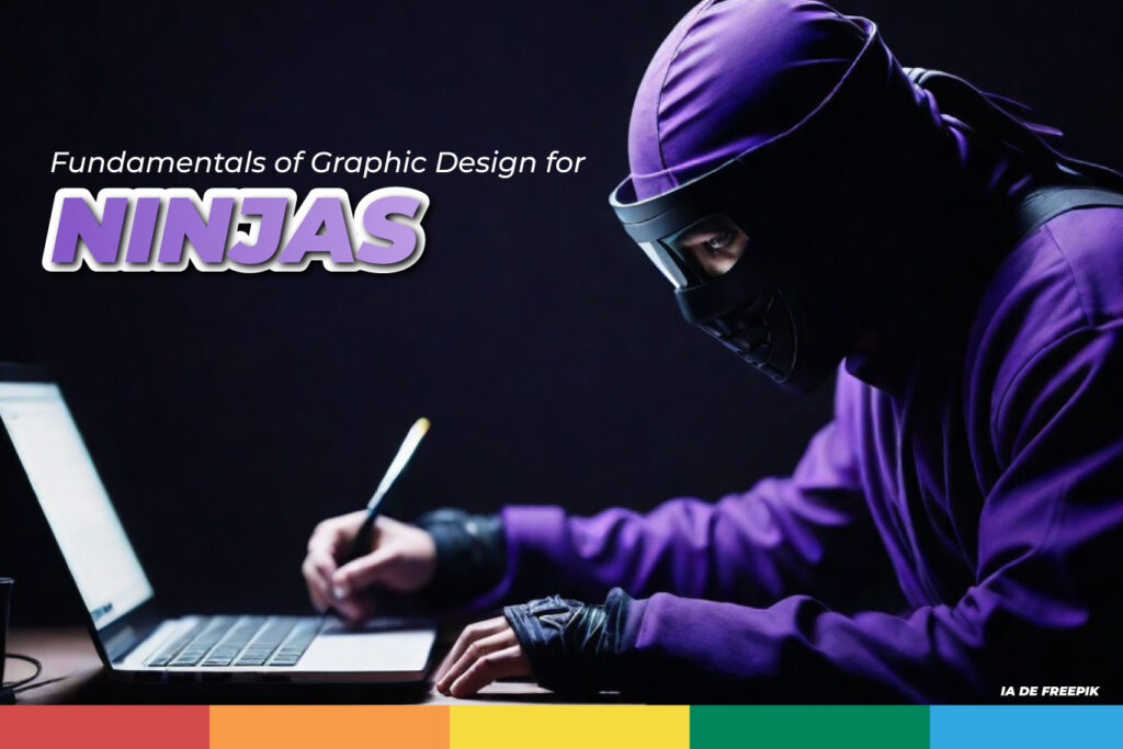
The ninja world is full of mystery, precision, and cunning, and graphic design is no exception.
Just like a ninja trains their body and mind to achieve glory, a graphic designer must train their mind and muse to master the fundamentals of design and create striking and effective visual pieces.
So, what are the fundamentals of graphic design?
Here we present several principles and basic elements to become a junior graphic designer in branding.
Like a ninja’s katana, it can be precise, fluid, powerful, and a fundamental piece to define their rank and how well-known they can be; The graphic line defines what the logo, elements, and visual part of a brand or company would be.
What should be evaluated to create a graphic line?
- Color: Color theory, similar to ninja camouflage techniques, allows creating harmony, emotion, and meaning through the combination of colors. And it is a fundamental piece depending on what, how, and which field you are going to design.
- Typography: The choice of typography, like choosing the right tool for a ninja, is crucial to communicate the message clearly and effectively.
- Composition: Composition, like ninja attack strategy, organizes design elements to create a harmonious and attractive visual experience.
Design Principles and Fundamentals
Just as a ninja has their unbreakable basic principles, graphic designers also have ours, and below I will show you some of them.
- Contrast: Contrast, like a ninja’s stealth in the darkness, creates emphasis, dynamism, and readability in design. Remember that if you are going to work on a light element, it must always, always, always, ALWAYS be on a dark background, and a dark element must be on a light background to be readable.
- Alignment: Alignment, like ninjutsu precision, brings order, balance, and harmony to the design.
- Hierarchy: Visual hierarchy, like the organization of a ninja village, defines the importance of elements and guides the viewer’s attention.
- Balance: Balance, like the ninja’s firm posture, distributes the visual weight of the composition harmoniously.
- Neuromarketing: Although you may think this should only be known by Social Media, content creators, or the person who will request the image or work to be done, you as the person specialized in creating visual or audiovisual material, must know the basics of this. Text positioning for better visualization, choosing the right image for greater attractiveness, etc.
- Minimalism: Ninjas are masters of efficiency. Minimalism in design seeks to communicate ideas with the least amount of elements, similar to ninja philosophy.
- Asymmetry: Ninjas adapt to any situation. Asymmetry in design creates dynamism and surprise, breaking with monotony.
- Negative Space: Negative space is as important as positive space for a ninja. The use of white space in design allows elements to breathe and creates a feeling of lightness.
The ninja world, with its focus on precision, efficiency, and adaptability, offers a valuable source of inspiration for graphic design. By mastering the fundamentals of design and applying ninja wisdom, you can create visual pieces that convey your message with strength, clarity, and beauty.
Embark on your path as a graphic design ninja and create works that make an impact!
And if you need a little help from our ninjas of graphic design, contact us!


